Colors and Fonts
Follow these design, color and font guidelines in marketing projects for Saint Louis University.
Primary Color Palette
One aspect of any brand that can be instantly recognizable and noticeable is color. Colors help define a mood and give a sense of character and personality. Our primary color palette is directly derived from our past. The palette has been consolidated and is now a staple for our future.

SLU Blue
PMS: 293C
CMYK: 100, 69, 0, 4
RGB: 0, 61, 165
HEX: 003DA5
Blue is seen as a dependable, trustworthy and strong color. Our primary color has always been blue and will continue to be. It incorporates our University's values of openness, leadership, confidence and boldness. The blue also embodies the two rivers that form the landscape of St. Louis.

College Church Gray
PMS: Cool Gray 3C
CMYK: 8, 5, 7, 16
RGB: 200, 201, 199
HEX: C8C9C7
College Church Gray is a neutral color that complements both SLU Blue and the secondary color palette, and works well in all settings.

Iris White
PMS: White
CMYK: 0, 0, 0, 0
RGB: 255, 255, 255,
Hex: FFFFFF
Iris White is a neutral color that complements both SLU Blue and the secondary color palette, and works well in all settings.
Secondary Color Palette
The secondary colors are bright and bold, showcasing the youthful and vibrant side of SLU. These colors are to be used sparingly as accents and should never replace the primary color palette.

Fountain Blue
PMS: 298C
CMYK: 58, 3,1,0
RGB: 83, 195, 238
HEX: 53C3EE

Grand Blue
PMS: 289C
CMYK: 100, 88, 39, 41
RGB: 0, 36, 77
HEX: 00244D

Billiken Bronze
PMS: 874C
CMYK: 40, 50, 83, 18
RGB: 121, 93, 62
HEX: 795D3E

West Pine Beige
PMS: 7527C
CMYK: 11, 9, 20, 0
RGB: 227, 222, 203
HEX: E3DECB

Gateway Gold
PMS: 123C for coated stock
114U for uncoated stock
CMYK: 0, 19, 89, 0
RGB: 255, 199, 44
HEX: FFC72C

Rooftop Teal
PMS: 337C
CMYK: 29, 0, 22, 0
RGB: 143, 214, 189
HEX: 8FD6BD

Oriflamme Orange
PMS: 144C
CMYK: 0, 51, 100, 0
RGB: 237, 139, 0
HEX: ED8B00

Valle Verde
PMS: 7487C
CMYK: 44, 0, 80, 0
RGB: 142, 231, 100
HEX: 8EE764
The colors of SLU's secondary palette are intended to add breadth and depth to SLU's overall look and feel. The color palette has been carefully selected to complement the other brand colors and to create a cohesive family that allows for a range of creative possibilities for the University master brand. Use of these elements in communications will help create and maintain a consistent look and feel for SLU's collective key audiences. Communicators are not required to use these colors, but please consider their use.
Fonts
Typography is an easy way to maintain brand presence and create a consistent visual identity throughout all platforms. The Saint Louis University identity system relies on three fonts: Crimson Pro, Brandon Grotesque and Archivo Narrow. These fonts should be used whenever and wherever possible, including printed materials, promotional materials, stationery and signage. The correct weight of each font should be carefully considered for each application to ensure maximum legibility.
Crimson Pro
 Crimson Pro is an extremely legible and versatile typeface. Crimson should be used
primarily as body copy. To enable flexibility within the typography applications,
three weights of Crimson are available for use: Roman, Semibold and Bold. Crimson
Pro is a Google font and therefore, it is free and accessible for all mediums (digital
and print).
If your primary use of the font is for print projects, use the Static version of the font and not the Variable Weight version (which is meant for web use).
Brandon Grotesque
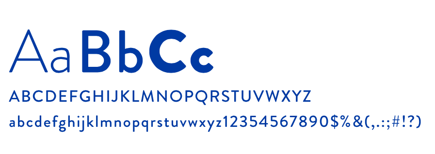 Brandon Grotesque is a strong, bold and contemporary typeface which can be read easily
from a great distance. It is SLU's headline font and therefore should be used primarily
in its bold weight and in all caps. Brandon Grotesque can be purchased at myfonts.com or for web through fonts.adobe.com.
Archivo Narrow
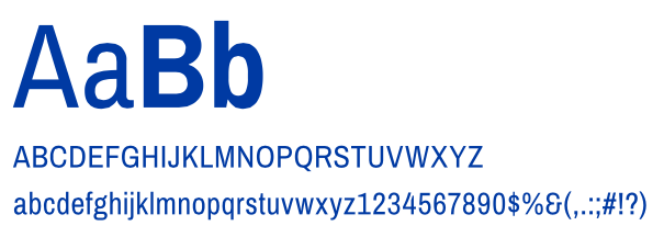
A condensed sans serif typeface, Archivo Narrow should be used for body copy when available layout space is tight. Like Crimson, Archivo is a Google font and free and accessible for all mediums (digital and print).


